One giant leap for the Australian space industry
Space Industry Association of Australia
One giant leap for the Australian space industry
Space Industry Association of Australia
The Space Industry Association of Australia (SIAA) is a nationwide organisation formed to promote the growth of the Australian space sector. Representing the Australian space industry and its members, SIAA acts as the formal voice in formulating national policies and strategies. Taking a leading role in advising government bodies and promoting opportunities for the development of the industry through its space-related technologies and services.
SIAA approached Pollen with the challenge of developing a new look for its brand identity, which had drifted away from the trajectory that the organisation’s vision and the industry it represents shared.
Naturally, as lovers of sci-fi and all things ‘space’ we were ready for this mission to take off.
A new identity was needed for their voice to be properly heard
Being the voice to large government bodies on behalf of its members, SIAA needed a brand that exuded maturity and authority. It also needed to inspire and unite the Australian space industry with an identity they could be proud of.
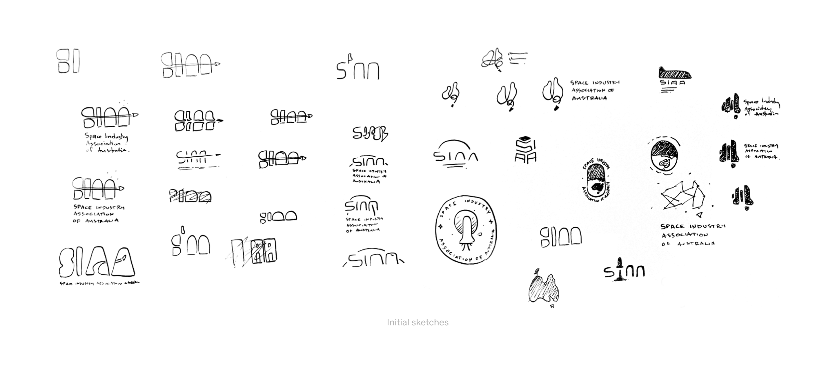
The approach for the new logo was to reference the old logo but beam it light years ahead. Using the SIAA acronym as the basis of the logomark and evolving the comet tail to be more integrated with the lettering. In addition, the Federation Star gives a subtle nod to Australia that isn’t forced or clichéd.
Finishing touches to the logo included, ensuring that the Federation Star concluded on an upward trajectory to represent the Australian space industry’s vision, and using the negative space beneath the comet tail to give the effect of light and shadow.
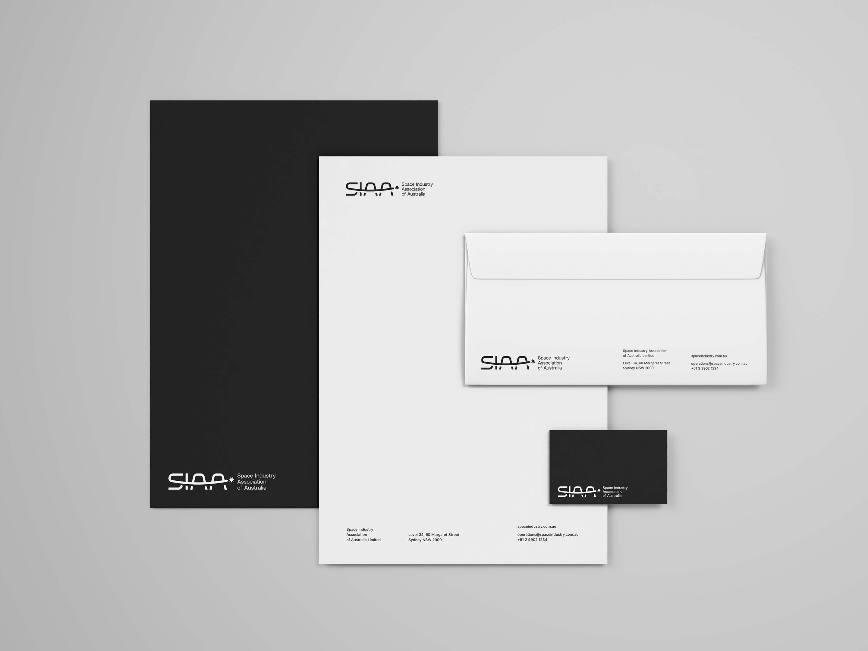
A simplified, stacked logotype anchors the logomark providing balance whether the logo were to be used in a horizontal or vertical orientation.

A dynamic and understated brand
Brand elements consisted of a monochromatic colour palette, a hero typeface (Poly Sans) that offered the perfect balance of form and function, and an emphasis on contrast in scale and tone.
With all brand elements combining to create a flexible brand that is dynamic yet still remains understated, SIAA and the Australian space industry can forge ahead to the future of space-related technologies and services.